welcome to the
Learn more about leveraging design and illustration for your business, email and marketing tips, and find out what is new at the Bloom Stud.io!
The Studio Journal
Marketing
Biz Tips
Illustration
Design
Around the Studio
explore
November 16, 2023
Workbook Design & Illustration: The Secret Sauce for Coaches & Course creators
Hey there, friend! It’s Mahala again, and today I’m excited to chat with you about how illustration and thoughtful workbook design can work wonders for your online course. We live in an increasingly visual world. The right imagery can make a world of difference in helping clients and students understand your lessons, retain information, and connect with your brand. So let’s dive in, shall we? 😊 Here are 3 huge reasons why Online Course Creators and Coaches can use worbook design & illustration to be your secret ingredient to online course success.

First of all, let’s talk about comprehension in your workbook design.
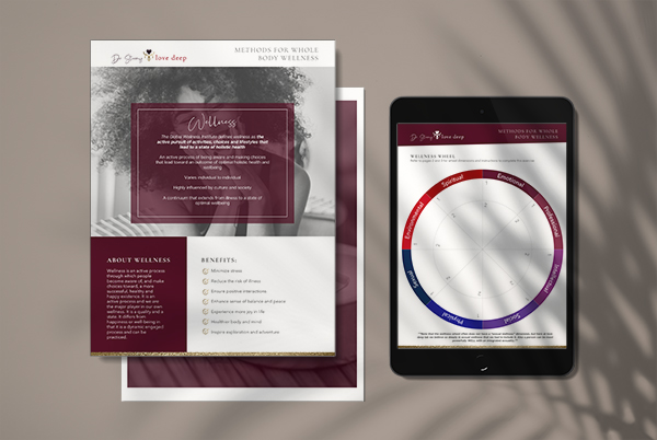
Sometimes, no matter how eloquently you explain a concept or idea, it can still be tricky for your students to grasp. That’s where the power of illustration comes in! A well-designed visual representation can clarify complex ideas, break down abstract concepts into digestible chunks, and make your lessons a lot more engaging. Trust me, your students will thank you for it!
Having an excellent workbook design will organize all of your information so that it’s easier for your students to read and follow. I have personally purchased courses that offer up worksheets that read like long, droning white papers. Yikes. When your customer pays for a course or coaching services, the last thing they want to find upon opening a workbook or worksheet is a wall of text with no formatting. It’s a good way to scare off your clients, and it comes across as stuffy and daunting to read.
A great workbook design, though? It will leave your clients hungry for more, and excited to make repeat purchases from you. You’ll be able to charge more, and feel good doing it because you’re giving them a premium experience that they deserve.
Now, about retention.
You know how they say a picture is worth a thousand words? Well, it’s true! Our brains are wired to process and remember visual information much more effectively than text alone. By incorporating illustrations into your course materials, you’ll be helping your students retain the information you’re teaching – making it easier for them to recall, apply, and even share their newfound knowledge. Plus, it adds a fun and engaging element to your course! 😉
Oh, and before I forget, let’s address a common worry many course creators have: students who purchase their courses only to vanish, never to return and finish the course. I hear you, and I totally understand the frustration! But guess what? Building a personal connection with your students through illustration and a bespoke look can work wonders in keeping them engaged and invested in your course. Let me explain how. 😊
Imagine this:

A woman in her 40’s, recently single and looking for new ways to reconnect with herself and remember who she is. She is looking for something soulful and beautiful, something that will set her spirit on fire and kindle her hope. She’s seeking a course or a coach to help her get back on track.
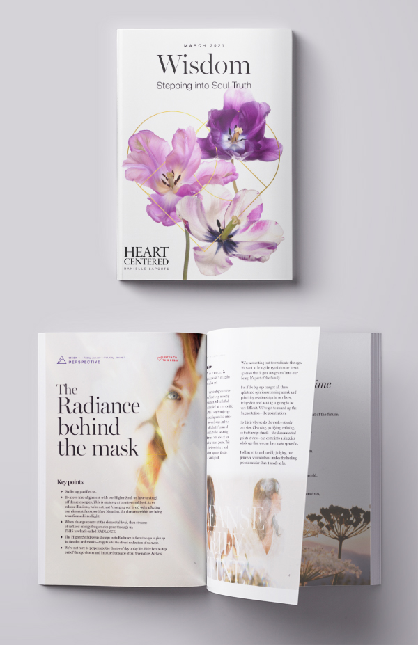
Which do you think she will connect with more? A lengthy word document or pdf with a white background and no formatting? Or a stunning, colorful workbook with spiritual, stylized graphics that speak to her need for something more tactile and real? Something that prioritizes clarity over vast walls of copy she’ll need to sift through to find what she’s looking for?
I know which one I’d pick.
Even if you want to create a longer document full of rich information, there’s definitely away to do this impactfully. Think magazines, books or e-pubs full of thoughtful articles and well-organized information, enhanced with illustration and photography, luxurious and a delight to experience. This could easily be your workbook design’s inspiration.
Building confidence in themselves, and you, through thoughtful workbook design.
When you create a visually stunning and enjoyable learning experience for your students, it helps build their confidence in you and your brand. It helps them believe in themselves, because it supports them in becoming successful in their goals in working with you. The attention you put into the details of their course materials speaks volumes about your dedication and passion for their success, and trust me, they can sense it. It’s like a warm hug from you, telling them you’re there to support them every step of the way.
Moreover, we’ve all been through one of those courses where we’re buried in tedious, monotonous whitepapers. Ugh, no thanks! By contrast, when you put time and effort into making your workbook design something special, your students will truly appreciate it. They’ll think, “Wow, if the course creator put this much care into designing the materials, the content must be top-notch, too!” And you know what that means? They’re more likely to stick around, complete the course, and even recommend it to others.
In conclusion…
So, my dear course creator friends, don’t underestimate the power of illustration and a bespoke look in forging a deep, lasting connection with your students. By showing them you care about their experience and success, you’re creating an environment where they feel valued, inspired, and motivated to see their learning journey through to the end. And that is a beautiful thing.
If you’re ready to bring your course materials to life with custom illustrations and a unique, tailored look, please don’t hesitate to reach out. Workbook design is one of BloomStud.io’s specialties, and is possibly my favorite kind of project. Together, we can create a learning experience your students will truly cherish. Let’s make your online course, workbook design, or worksheets a visual masterpiece, together! 🌟

Owner & Designer
BloomStud.io